Friday, 23 October 2015

The Waterloo Cartoon


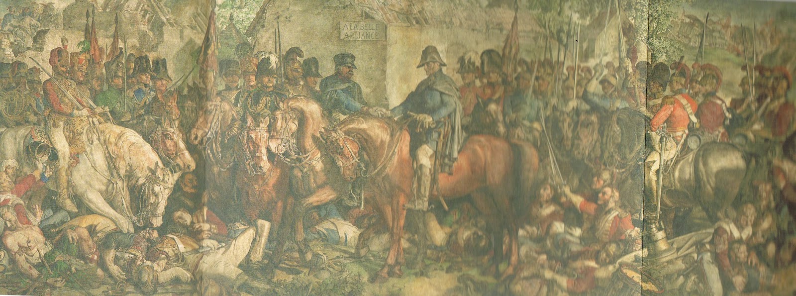
The Waterloo Cartoon was produced by Daniel Maclise in order to win a commission which would hang in the Royal Gallery within the Houses of Parliament. The drawing or cartoon as referred to at the time was done using chalk and first shown in the House of Lords in 1859. Standing at over 3 metres high and 13 metres wide this cartoon is on an epic scale both in size and in the quality of the draughtsmanship displayed. Prior to attending this exhibition I had actually seen the final painting hanging in the Royal Gallery just a few days previous along with another of Maclise's paintings which hangs directly opposite and is on the very same scale. An image of a section of the final painting is shown below (Fig 1). The painting although very grand blends into it's surroundings within the Royal Gallery and can seem rather unappreciated as it joins with all the other masterpieces on show which combine to create the gallery. However when the cartoon is seen on its own displayed within the RA you can get a real sense of the scale, work, skill and the level of both details and thought that went into creating such a work (Fig 2).
Fig 1
Fig 2
The cartoon is something that can be admired from a distance as you take in the whole scene. Getting up close usually leads to becoming lost in the fine details within the cartoon then having your eye lead through the image until before you knew you were metres away from where you had started. The term cartoon was not used how we know it as today, the term was used to suggest a proprietary piece of work rather than the finished article. Many of the greatest artists through history used this technique including Da Vinci and Raphael. The most common practise was to use these full scale proprietary cartoons to transfer the image onto walls or canvas. The process usually involved making pinpricks along each line of the image, then by fixing the paper in place and then rubbing soot over the back of the image to create a mirror image of the composition. This often lead to the destruction of cartoons as they had effectively done their job, although some still survive today. However Maclise never used this method of transfer, instead opting to recreate each of the ten panels into one full finished piece. This meant that this complete image was created then copied again to be painted at the exact same scale. The seems a miraculous achievement to me, not just to be able to create such a piece of work but to then also copy it exactly. The cartoon for me is actually more impressive than the finished painting, the details, the accuracy, the facial expressions are far more evident within the cartoon. The cartoon shows Maclise's knowledge and understanding of both tone and composition which are both key fundamentals of art. These are also areas I feel I need to improve on hence the reasons for my interest in this cartoon.
Until a few weeks ago I had never heard the term cartoon being used in reference to a proprietary drawing. This was something I picked up from a James Gurney book Imaginative Realism. I knew that this procedure encompassed all the fundamentals of art practise and learning this would be of great benefit to my own work. This lead to me finding out about the Daniel Maclise cartoon on show at the RA. There are many things to learn from this work including the fact that Maclise has used other past masterpieces such as Raft of the Medusa as reference for some of his characters portrait within this image. This technique of creating a cartoon could be used within my own work and probably used much simpler within the digital realm. The image would not need transferred but layered in, perhaps playing with layer blending of overlay, screen etc would let such work become part of the final image, this is something I will have to experiment with to see what works for me.

The main things I picked up whilst doing some sketches were a few of the poses but mostly what struck me was the very clever composition. The full image can be broken down into four main layers, the first consisting of the fallen soldiers and horses which all lead towards the central characters who are the focus of this piece. The first area shows these soldiers and horses who are either dead, dying, injured or giving support to those in need. This is very clever use of space by Maclise, not only does is show the destructive elements of war but it establishes the ground level for all of the soldiers and horses who stand behind them in section two. The image would also seem bare if all were standing and ground could be seen, the ground is only evident where the central two horses stand. This allows a lighter area within the image that draws the eye towards the centre.
The second area comprises of all the soldiers and horses that are standing, these create what is essentially the eye level of the viewer or artist as they are quite consistent in their level through the image. The clever technique Maclise has used in this area is that most characters portrait are looking towards the centre. The invites the viewer to also look at what it is they are looking at, if you pass someone in the street looking at the sky you will most likely look upwards too.
The third section gives the meeting a setting by having the buildings behind. Again these buildings are positioned centrally which only strengthen the composition further tying everything together. The buildings are also used to signify La Belle Alliance which was the inn where the allied forces are rumoured to have met, and was formerly Napoleon's battle headquarters. Although history is told by the winners so I'm not sure how much truth is in such facts.
The forth and final section which makes up the background is used to essentially tell more of the story. We see the French being pursued by the Prussians and effectively being chased from the image.
There were also many other works on display through in the next room from the Maclise cartoon. Many images displayed how the French felt about the Allied forces and showed much humour or depicted how they seen the wars. Many of these images also interested me in their compositions and characters are shown below. Some depicted horses which I could be useful as I have an image for a story idea which contains a unicorn. The sketches I took from these are also shown below.


Cartoon Museum

During my time in London I went to visit the Cartoon Museum which is situated near the British Museum. This was just a small museum but it held within it some really interesting work which might influence work of my own. The work on show included an image from the Roy of the Rovers comic strip (Fig 1). This was something I used to read and draw from as a young boy and made me realise that such things have probably influenced me without even thinking or knowing until seeing such images again. The museum showed great examples of works in progress which is something I am definitely considering showing within my final piece for this project (Fig 2) (Fig 3). There was also an image from Alice in Wonderland which shows the cat as almost translucent. This is not so easily spotted when first approaching the image. I have shown a section of the image containing the cat (Fig 4). This might be something I could use to put things in an image that are not so obvious but are visible yet have to be found. Unfortunately I didn't have much time in the Cartoon Museum hence the reason there are only photos but I'm glad I had popped in to see what it was all about and will be sure to visit again whenever I am back in London.
Fig 1
Fig 2
Fig 2


Fig 3

Fig 4


Thursday, 22 October 2015

British Museum


On Monday I went to visit the British Museum to view the exhibition Drawing in silver and gold. This exhibition is showing works from some of the finest artists from throughout history. The focus is purely on art created using the metal point technique. This was something I had been unaware of as a technique so I wanted to find out more about it. The  technique actually involves much preparation in the paper that will be used to draw upon. The paper must be treated to build an abrasive surface, this allows for the metal stylus to rub off onto the paper. The lines are very fine and delicate and require accuracy in drawing as they cannot be erased. The technique seems very technical and most likely expensive to draw in silver or gold. However exposing myself to new ideas is always a good thing and something can always be learnt. This technique is unlikely to become something I use for my project but may lay as a back burner idea for something new to try in the future. Many of the works on display show immense understanding of their subject, control of the materials and an economical use of line, which is a term I had never come across before. This does not mean that they were saving money by not using much silver but they only put lines where they were actually required. This requires much attention to detail, thought and consideration before each mark is made. There was one image which interested me as I have a slight idea for an image I wish to portrait in a story, this may come in useful later to draw ideas from and is shown below (Fig 1).
Fig 1
During my time in the exhibition I found that I became interested in the people also viewing the works(Fig 2). I decided to sketch some of these people, I believe I had been inspired by a book I read the night before on urban sketching.

Fig 2
After leaving the exhibition I went to look at further artworks and other historical artefacts during which time I found a plaque explaining some student artworks that were on display. The description of what they works are about "Wayfinding" seemed to explain exactly how I felt about this honours project at that moment in time (Fig 3).
Fig 3
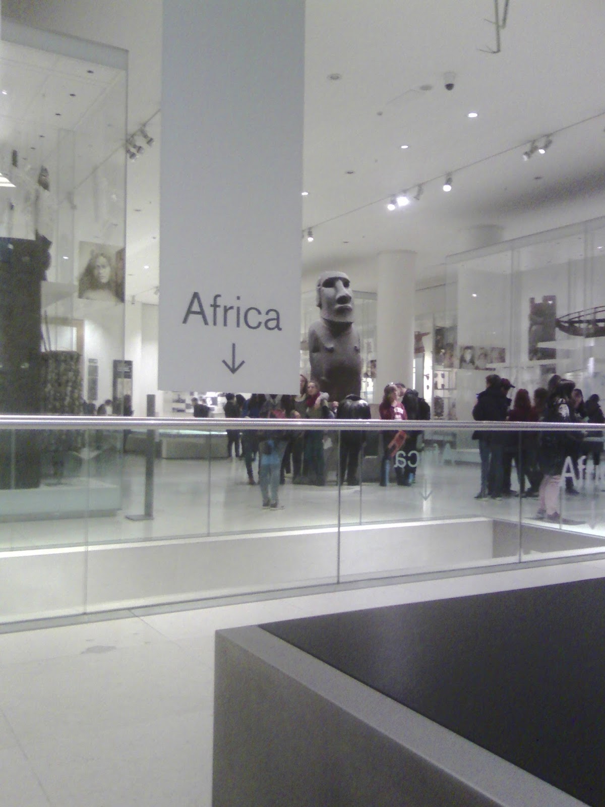
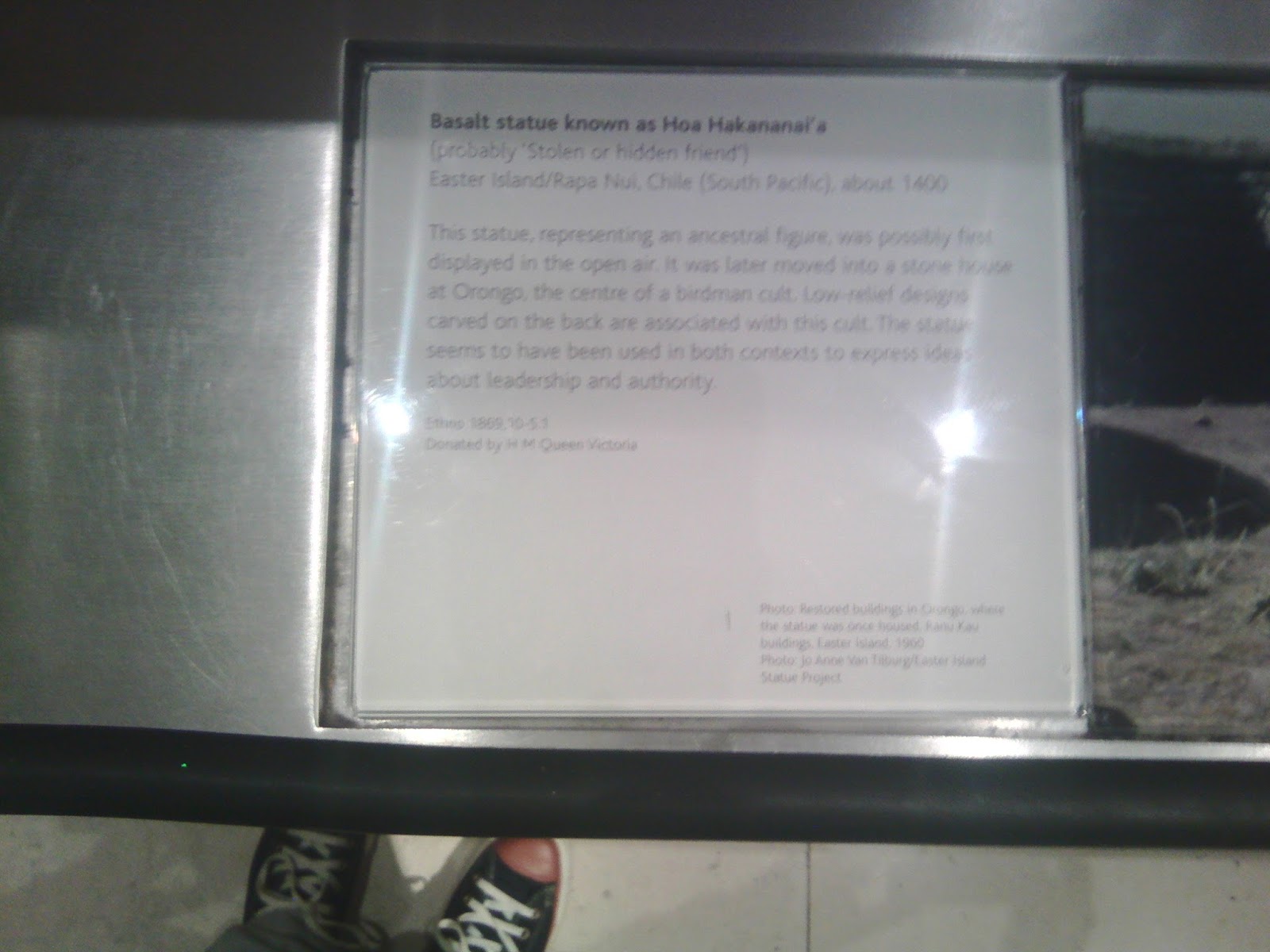
I also happened to come across a stone sculpture which intrigued me. I decided to sketch this as I feel the face of this character fits someone I want to portrait within my story, after reading the descriptor I knew he just fits the bill perfectly (Fig 4).

Fig 4
There were also some other artefacts which interested me, mainly a giant vase which I imagined as the cup of a giant, almost like a goblet. This is shown below (Fig 5). This might make it into a scene in my story, only time will tell. The trip to the British Museum threw up some unexpected results, my curiosity for others in the building. Why were they there? What were they there to see? How rather than trying to copy art from masters I had a variety of other resources to pull from throughout the museum that could lead to something far more original and inspire me in many ways. Each artefact has its own story, where had it been? who created it? this seems a far more interesting path to follow and also reinvigorated my interest in the people who are here today, they ones surrounding me.


Dominic Mckenzie

On Sunday I attended a workshop run by Dominic McKenzie which was held at House of Illustration. Dominic works as an editorial illustrator with the focus of the workshop being on the topic of illustrating an idea. This was actually what kickstarted my idea for my visit to London. Learning how others approach work, especially as this was illustration based was key to my interest in the workshop. Due to Dominic working in editorial I knew that this workshop would probably look at things in a slightly different manner as to other workshops I have previously attended elsewhere. Also gaining a better understanding of what House of Illustration actually was, where it was based etc were important for me to find out about. Not only for this project but for future reference and use.
The first task Dominic set the group was to try to draw and image that explained who you are as a person. I felt that I am a person when confronted with a question that interests me will dig until they find the answer, although this may reveal more questions. This illustration was then passed to the person next to you for them to try and decide what it said about your personality. Mine was not clearly understood but showed me just because something is clear to me it may not be for others and visa versa. The next task was looking a the most basic of symbols i.e. male/female signs for toilets. We were then to try and design a sign for the House of Illustration in as simple a fashion as possible. This task actually proved very difficult as I had to ask how can illustration be signified? Both tasks were done in a short space of time and are shown below.
Our next task was titled words as image, which we were given six words. The words themselves were to be illustrated in whatever fashion came to mind. This again was difficult to think of lots of ways to illustrate a word in a short time. The exercise might prove useful in future projects though if I am having difficulties trying to work out how to illustrate what I am trying to say. Illustrating the actual words may inspire the illustrations themselves or at least strengthen them. The words chosen are shown below and was interesting to see what others had also done.
The  next task was to create a metaphor portrait, we were shown four images of well known people and asked to try and portrait them using things they were associated with. I chose Andy Warhol who instantly made me think of repetition. I then tried to think of ideas for David Beckham but actually found him far more difficult to portrait. We were to create a final image then swap with the person next to you. We then discussed their work, something you liked and also where it could be improved. This exercise proved useful although I quickly realised that I had mixed up Warhol's Campbell's soup with beans for some reason. When my work was discussed Dominic stated that he would have taken the can away and just had the repeating images of Warhol alone. This is what I had done as my first idea so I was aware that Dominic had seen this sketch and obviously felt it was much stronger in it's portrait of Andy Warhol.

The penultimate task was to work with the person next to me and decipher an article written for Variety Magazine. The article was about the influence of Billionaires on Hollywood and is shown below. Working with someone trying to illustrate this article was very difficult as most of the time seemed to be in discussion about the article itself. There were several ideas thrown around some of which are shown below.
The final task of the day was to read another article written for the Guardian on doping in athletics then illustrate what we thought would be appropriate. This task was to be done alone and then we would pick what we thought was the strongest image and discuss at the end. From the images shown below I had picked the tidal wave chasing the athletes down the track. Although after everyone had discussed there choices Dominic stated that if he were to illustrate this article he would have someone jumping a hurdle as this was the main topic within the article. Would athletics be able to get over the latest doping allegations which are reported to be widespread, who could lead them out of this situation? The hurdle seemed a perfect metaphor, again I am aware that Dominic had seen the image I had done of the athlete jumping the hurdle made from a needle. In other words he was making me aware that I had done the correct image but had made a bad choice when picking the strongest, strangely the partner from the previous task had said that was her immediate favourite. 
During the workshop Dominic had decide to show everyone my sketchbook as he was trying to show the importance of just getting rough ideas down quickly. The fact he gave subtle advice on my choices etc during the class were valuable appraisals, along with a short speech at the end where he thought some people had went from 0-60 in the short session we had. I personally felt as though I was one of these people as I could see a definite progression in my understanding of what I was trying to achieve through the images produced. They way Dominic also said well done at the end to me personally felt like a pat on the back. This workshop took place directly after seeing the Ai WeiWei exhibition, it took me from trying to think in a very highly conceptional manner to a slightly more grounded version. I understand that creating something that requires thought or is thought provoking can be very interesting for me and my audience. However there is no point in me making works that cannot be understood without explanation which was sometimes the case at the exhibition. This is probably even more prevalent within the medium of picture books, I don't want something neither the child or adult are able to understand as this will lose their interest in the story no matter how interesting I can make the images.


Ai WeiWei

During my stay in London I attended an exhibition at the Royal Academy of Arts showing a body of work by the acclaimed Chinese artist Ai WeiWei. This exhibition gave me any opportunity to step outside the world of picture books and into the world of highly conceptual art. This may influence my project or future works without my own realisation. The exhibition offered a chance to understand, and gain a possible insight into how others work and think. Also reflecting on what my own experience of seeing such works was a very important aspect of this visit. I went with a strategy of trying to understand the works before reading any descriptions on the pieces to see what I got from them without any preconceptions in mind. With some this was difficult after seeing previous interviews etc about the exhibition.
Upon arrival at the RA you are faced with Ai WeiWei's first piece which lies within the external courtyard of the buildings. Trees that have been made from sections of different trees with a single seat in between them. My own initial thoughts on this piece was how striking the trees were in their presence, probably with such dominating thick branches. My views on the thinking were that this was an environmental statement highlighting the fact that trees cannot be manufactured. Trees can only grow naturally and be connected as one not a series of parts constructed together. The work represents China and the chair within is used to represent Beijing as the seat of power in China. The trees are constructed from timbers collected from all areas of China, these show how China is interconnected and pieced together, each area of china is represented within this piece. To me I still believe there is an element of the environment within this work. Ai WeiWei is aware that China is the largest manufacturer in the world, but to what cost on their environment. Each area of China represented may also demonstrate their contribution to the manufacturing as in a section within a tree (or a branch) within of the processes of mass production. The notes taken and images created by myself in response to the work are shown below.

Once inside the RA there are many pieces of work on display as this is a body of work created over many years. One such piece is titled straight and is constructed solely of metal re-bar which is used as the main reinforcement within concrete structures. When first confronted with this sculpture my instincts were that the fault lines within the Earth were what was on display. The room itself also displayed thousands of names in Chinese and a video with photos from an earthquake that devastated many rural towns in China. I had misunderstood the concept, the re-bar was salvaged from the wreckage of schools destroyed in the earthquake. Each twisted piece of steel has been straightened out to it's original state prior to use in constructing the schools. In many areas the schools seemed to suffer far worse consequences that other buildings. This has been put down to corruption leading to the use of inadequate materials to build the schools in the first place. The piece of work is a demonstration against this, especially as the Chinese government was unwilling to release numbers or names of all of those who suffered. The lists on the walls were in recognition of these children who lost their lives, as the names were gathered by travelling through these regions and collecting names and details over a long period of time. This piece seems much clearer to me now on reflection as I write this blog. The steel re-bar used to create the works seemed to comprise of rather small diameter steel. I know from my background in construction that these seems flimsy when I think about how concrete buildings are constructed and the diameter of steel rods used are usually much larger. My notes and photos of this particular work are shown below.

There were many interesting sculptures which included some that were carved from timber that had been joined together by using many different pieces. The joints used in the construction of this work showed real craftsmanship as would have required many months of planning, preparation and execution of this particular work. The concept was rather lost on me without reading the descriptor. Once I read that each sculpture represented mainland China and the islands which are a part of their territory I began to understand what the piece was. Ai WeiWei has taken a map of the land, split it into two pieces, flipped one 180 and joined them together to give the shapes seen. Then constructed these shapes from timbers joined together. I am unsure whether each piece of timber represents a territory within the map as a whole i.e. if the was the UK each timber would be the shape of the county it represents.


Ai WeiWei also creates sculptures from furniture which made me ask myself the question, what is a table? If asked to draw one I would presume to draw a table with four legs resting on a floor, but the photos above show that this doesn't have to be the case. These tables rest upon the walls as much as the floor, are they now seats as much as tables? Has their use changed along with their appearance and construction. The sculpture below actually made me stand in amazement. When I first walked into the room I thought Oh No someone has just stuck a bunch of stools together. But then as I studied the work I realised that they may seem like stools but each they are a series of circular tops with legs that are all interconnected to each other. So they appear as three legged stools but are in fact tops which have only one or two legs attached to each. The thought process, trials, drawings and construction of this sculpture are all of the upmost quality.
Many of the works within this exhibition question mass manufacturing, the value on things and show a heavy emphasis on craftsmanship. These are displayed through the choice of materials Ai WeiWei chooses to work with, the methods in how they are constructed and the messages or thoughts they provoke. The vases that are displayed in one open up many of these questions. One vase has the Coca Cola logo painted over it, others have been dipped in painted, some have been grinned down into dust, photos also show Ai Wei Wei dropping a vase. These vases comprise of ancient vases and some that has been produced recently using the exact same methods and materials used to produce the ancient vases. This puts into question value, why do we place such value on ancient artefacts? Is it the history attached to them? Do we wonder at how many and who's hands they may have passed through in their history? The materials can be of no more value than the newly created vases, does the production of mass market corporation devalue from modern items?
There are many other works that I could discuss but I have stuck to the ones that had the most impact upon me. One such work is titled Fragments and is the last to be discussed. This particular sculpture has been created from timbers collected from old ruined Qing Dynasty palaces and buildings. Many pieces of the timbers show carvings and decoration which leads the imagination to consider how they were previously displayed in very opulent surroundings. The timbers are joined together using traditional Chinese methods including pinning, mortice and tenon and bracings of various types. The piece as a whole looks rather like fingers all interconnected with tables and chairs sewn into the fabric of the sculpture with one single standalone stool. The piece is very intriguing to walk around and look at, understanding the work though can only be done from above. The full piece creates a map of China with the single stool representing Tiawan.
This exhibition may find a way into my work, it may not but I am sure I will always remember the works seen at this event. The reason I wanted to go to this particular exhibition was to expose myself to works, ways of thinking and concepts I had never encountered before. The impact I hope it may have on me is to possibly think much deeper about how I can present things. How can I play with ideas, what is it I want to say? How can I transform one object or image into something else and give it meaning? The thing that has left the biggest impression on me was the sheer quality of the work. I am aware that Ai WeiWei is a conceptual artist and most of the work is actually created by artists and technicians within his studio. However the level of craftsmanship is obviously key to Ai WeiWei and is prevalent in every piece on display. He has a large focus on traditional methods which are being lost to mass production methods. The work was more than fitting to the surroundings of the RA buildings. Each piece is not only high concept which is more than usual very difficult to understand without some explanation, but also produced to the highest quality.