The Waterloo Cartoon was produced by Daniel Maclise in order to win a commission which would hang in the Royal Gallery within the Houses of Parliament. The drawing or cartoon as referred to at the time was done using chalk and first shown in the House of Lords in 1859. Standing at over 3 metres high and 13 metres wide this cartoon is on an epic scale both in size and in the quality of the draughtsmanship displayed. Prior to attending this exhibition I had actually seen the final painting hanging in the Royal Gallery just a few days previous along with another of Maclise's paintings which hangs directly opposite and is on the very same scale. An image of a section of the final painting is shown below (Fig 1). The painting although very grand blends into it's surroundings within the Royal Gallery and can seem rather unappreciated as it joins with all the other masterpieces on show which combine to create the gallery. However when the cartoon is seen on its own displayed within the RA you can get a real sense of the scale, work, skill and the level of both details and thought that went into creating such a work (Fig 2).
 |
| Fig 1 |
 |
| Fig 2 |
Until a few weeks ago I had never heard the term cartoon being used in reference to a proprietary drawing. This was something I picked up from a James Gurney book Imaginative Realism. I knew that this procedure encompassed all the fundamentals of art practise and learning this would be of great benefit to my own work. This lead to me finding out about the Daniel Maclise cartoon on show at the RA. There are many things to learn from this work including the fact that Maclise has used other past masterpieces such as Raft of the Medusa as reference for some of his characters portrait within this image. This technique of creating a cartoon could be used within my own work and probably used much simpler within the digital realm. The image would not need transferred but layered in, perhaps playing with layer blending of overlay, screen etc would let such work become part of the final image, this is something I will have to experiment with to see what works for me.
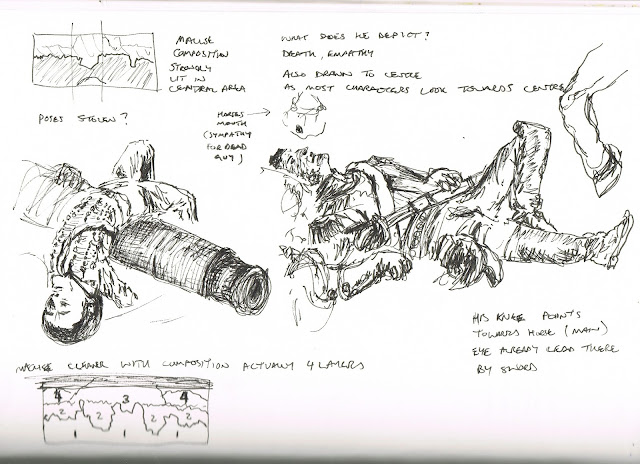
The second area comprises of all the soldiers and horses that are standing, these create what is essentially the eye level of the viewer or artist as they are quite consistent in their level through the image. The clever technique Maclise has used in this area is that most characters portrait are looking towards the centre. The invites the viewer to also look at what it is they are looking at, if you pass someone in the street looking at the sky you will most likely look upwards too.
The third section gives the meeting a setting by having the buildings behind. Again these buildings are positioned centrally which only strengthen the composition further tying everything together. The buildings are also used to signify La Belle Alliance which was the inn where the allied forces are rumoured to have met, and was formerly Napoleon's battle headquarters. Although history is told by the winners so I'm not sure how much truth is in such facts.
The forth and final section which makes up the background is used to essentially tell more of the story. We see the French being pursued by the Prussians and effectively being chased from the image.
There were also many other works on display through in the next room from the Maclise cartoon. Many images displayed how the French felt about the Allied forces and showed much humour or depicted how they seen the wars. Many of these images also interested me in their compositions and characters are shown below. Some depicted horses which I could be useful as I have an image for a story idea which contains a unicorn. The sketches I took from these are also shown below.


No comments:
Post a Comment