Progress
This week has seen the beginning of me actually making art that will be used in the final dummy version of the book. The schedule had shown the pages 2-7 would be complete by this point, however pages 2-3 are still being worked on so I have fallen behind my latest schedule already.
Reflection
The first initial image has taken far longer than expected although I realise that there is far more in detail, characters and the setting itself than will be in most images. The timing is important but due to this image being used for both sets of end papers and possibly the poster taking my time is more important. The idea I had of combining drawing and painting seems to work and should give me a coherent style that will be seen throughout the book.
Idea
One idea I have to save some time is to not create the same rough images for the two final images. Instead I will work straight into colour, these images may actually vary in style as they are supposed to represent paintings in a gallery so they should perhaps look as if done by different artists. this is one way of saving time as I already realise that my method of working may be rather time consuming.
Tuesday, 23 February 2016
Balcony spaces
Much like the billboard space the balconies will be tackled in the same manner. Using this method allows for more detail as I am working to a larger scale than what the image will be in the final piece. This is helpful as the materials do not necessarily allow for fine detail. Creating something that does not seem very detailed can then become so when scaled down so many small artefacts can be placed within a scene. The idea is not to have to much detail so combining both the drawings and painting will allow me to decide what details should be left in and what should be removed. I created a stencil type image to allow me to place doors, windows etc and one image for the small wall and railing. Each of these will have to be altered slightly to help with perspective. The template, railing and first balcony image are shown below.
 |
| template for balcony |
 |
| railing drawing |
 |
| railing painting |
 |
| first balcony drawing |
 |
| first balcony painting |
Billboard space
Contained within the image for pages 2 and 3 there is a space left out for a billboard. The space should give information or relate to the overall theme of the story. As the story is based on the theme of slavery I though that having something related to the fashion industry might be appropriate. Thinking further though I realised that our consumer based economy feeds many aspects of slavery so I decided to make an advert for black friday as this covers more than just fashion. There is also debate as to the true meaning of black friday. People from retail explain that this particular weekend was always seen as working to a loss financially, i.e. in the red. So they created black friday to turn things around and make a profit, i.e. in the black. However other contest that this is an old term related to slavery. Friday was the day slaves were bought and sold in what were essentially human markets and this is where the term derives from. Due to this debate I felt that having this type of argument lead me to choosing such an advert for the billboard as it relates to the themes in many ways. To make the billboard I took the shape from the image, scaled it up to fill an a4 sheet and then drew this on a separate piece of paper with the inanition of scanning and then scaling down. The shape and images are shown below.
Working out style for rougher images
Over the last week I have been working on the image for pages 2 and 3, the main scene will again be used for pages 30 and 31 and possibly for my poster for the exhibition. As the image has multiple uses and contains a great deal of information I felt it was worth while taking some time on the image itself. My idea began with creating a composition through a collage of images which is shown below.
The next step was for me to draw a version of this image, however I chose to work with only four colours to try and improve my understanding of tonal work. This is something I seem to have issues with and is something that has became apparent through this project. After finishing the drawing I would scan in the image, then I go over the image with a brush and change it to a more watercolour type of image. These two images are then combined, further experimentation will be required to see what gets me the best results. The drawing, painting and a few versions of the combined images are shown below.
 |
| Drawing |
 |
| Painting |
 |
| combined with little alteration |
 |
| playing with colour values |
 |
| playing with contrast, lighting etc |
 |
| removing much of the drawing from the background |
Monday, 15 February 2016
wc 15/02/16 progress, reflection and ideas
Progress
This week has seen the completion of the second and third case studies. The ethics form is still to be re-submitted and a style is to be developed for all rougher works.
The next week shows that pages 2-7 should be drawn in this rougher style.
Reflection
I have not made as much progress as hoped, however the third case study involved more work than imagined. This did prove useful though as the story text has now been re-written and I do feel that there are definite improvements made.
Ideas
Firstly to get ethics form re-submitted, this then lets me use the images created for pages 2-7 to develop a style or look that can be used for all images throughout the book. This week will give a good indication on how much work is required for each spread and if my schedule is realistic.
1st draft: Helen Ward
Today I have written up the third case study on author Helen Ward. This may undergo further iteration prior to completion of my dissertation. The case study is shown below.
Saturday, 13 February 2016
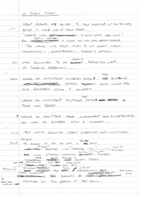
Story re-written
I have written the story out again just as a text, this tries to tackle the issues raised at my last meeting and also many of the issues raised through studying the work of Helen Ward. Each time I have either hand written or typed out the story has altered slightly. This is something that is likely to continue through the project with small iterations happening as progress occurs. Both the hand written and typed formats are shown below and the story itself seems more complete in nature. Hopefully through time and further meetings any other issues will raise themselves to allow for solutions.
Themes and scenes
Before trying to rewrite the story by adding or subtracting words or sentences I thought it might be useful to write down what themes, emotions, words or ideas came to mind for each double spread. In hindsight this exercise is something that perhaps should have been done prior to any thumbnails or at least before the first dummy version was created. I think this way because I realise that I am already influenced by the work I have previously done for each spread. Carrying out this exercise earlier may have lead to different results with both textual and visual elements of the story. Although changes can be made at any time to either which is what I like about being both author and illustrator. The notes taken from this exercise are shown below.
Extracting my own words
After studying the textual elements of the work of Helen Ward I decided to carry out a similar experiment with my own words. Even as I began typing them out changes occurred. However after printing out and marking yup the actions, descriptive words and sounds I have realised that my own work lacks in many ways. This is good though as without doing the exercises with the work of Helen Ward I may never have come to this realisation. The words are shown below but many highlights are not visible with scan. My next step is to rework the textual element of my story.
Case study: Helen Ward, The Tin Forest
The Tin Forest is interesting when compared to Varmints as the use of words that imply sounds only begin to appear in the later half of the story. This helps to reinforce the almost deadness of the world and highlight the life beginning with the arrival of the animals to the forest. The text uses a lot of descriptive words and state things that need to be in the illustrations. Of course the illustrator can add to all these elements by introducing characters or elements that are not stated in the text. The notes taken are shown below although only some colours show on the scans.
Case study: Helen Ward, Varmints
A similar technique was used to analyse the textual element of the picture book Varmints. The most noticeable difference between this and The Dragon Machine is the amount of references to sounds. This really brings the story to life as all these sounds can be imagined as the reader follows the story. The world seems full of pleasant sounds then there is a lull filled with just noises backed with words such as fury, the more pleasant sounds return in the end. Again the highlighted sheets do not seem to scan many highlighter colours but this exercise has shown me a useful way to bring life to a story.
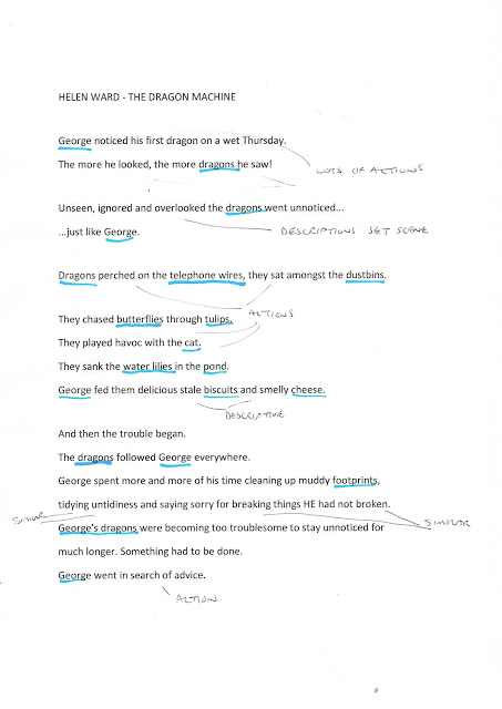
Case study: Helen Ward, The Dragon Machine
Helen Ward is mainly considered as an author although she has also illustrated her own works. For the purposes of the case study I have chosen three books where she is the author and the words have been illustrated by another. The reason for this is that I wanted to extract the words from the books and study these textual elements on there own. Trying to find patterns, techniques or methods used in her writing may inform my own project. The words are shown below and I have highlighted to actions, descriptive words and sounds although I have noticed some colours do not show on the scanned copies.
1st draft: Levi Pinfold
I have written up my second case study based on the works of artist Levi Pinfold. I will need to contact the publishers templar and lothian books to ask for permission to use the images contained within both of my studies. The 1st draft is shown below and will likely be iterated prior to my final dissertation hand-in.
Monday, 8 February 2016
wc 08/02/16 progress, reflection and ideas
Progress
This week I have carried out the rest of the second case study on artist Levi Pinfold, the final written piece is still to type up but this will be done very soon. The stories of Helen Ward have been typed up and this third case study will be carried out over the next few days. The second dummy version was made and feedback has been given upon where improvements can be made. A new programme of works has been created to show exactly what needs to be done each week for this project to be completed on time.
Reflection
This week has seen definite progress and I feel that I am almost over the hurdles of case studies. I do think I should have spent more time considering how the overall rough images may look, but this can be given more consideration this week. the story itself seems to be coming together and hopefully after the third case study improvements can be made to the textual elements and on areas discussed during my feedback session.
Ideas
To work strictly to programme, this week will require the second and third case studies finished completely, the ethics form will need to be re-submitted and a style will need to be developed for all images. This style will be the coherent part of the book even though it may be rather rougher than any finished images they should all tell the story in themselves. Perhaps using one of the images that will be used in the book and developing several versions or styles will in effect save one drawing from being done, this will save some time which is now become very precious.
Dummy version 2 colour
Today I made a colour version of the book to see how the colour changes flow. Unfortunately these can only really be seen when the pages are more worked up. Due to me experimenting with so many brushes and styles of illustration some images lack the full sense of colour or finish to judge whether they are working or not. This was still worth while but I will now need to concentrate on changing the text and images to create a story that flows, work on the compositions and get all the drawings to the same stage in the same style before choosing two to work up to final images.
New Programme of works
I decided today that I really need to create a new programme of works that would focus my objectives from now till the end of the course. The second case study is not mentioned as i have practically finished it. The main difference is that I don't intend to print prior to the Bologna book fair, instead I will just take a small pock size handmade book that will be easy to carry around with me and show to anyone that is interested. There is still a huge amount of work to be done to create this dummy book and this programme does not really allow for any slippage in time. However this now gives me definite tasks that must be finished each week in rode to complete the project or get it to the stage I had proposed. A copy of this programme is shown below and now hangs on my wall.
Sunday, 7 February 2016
Comparative study: Levi Pinfold
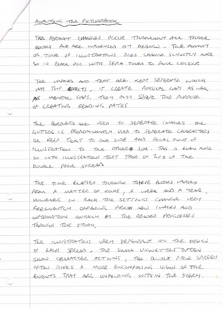
I have carried out a comparative study based upon the three case studies of the work of Levi Pinfold. This looked at patterns, techniques or any other elements that are important in his three books that have been published so far. The Django, Black Dog and Greenling were all studied and compared, the results are shown below although a final typed report will be created as part of my dissertation.
Subscribe to:
Comments (Atom)


