Saturday, 30 January 2016

Playing around with brushes

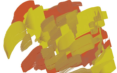
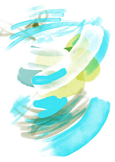
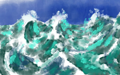
Over the last few days I have been downloading a variety of digital brush sets and playing around with them to see how they might be used in my work. Many of the sets include brushes that are for certain effects such as water, fur or skin and others are pattern and texture based. These textures may be used put perhaps not consistently so that patterns are not obvious. There were two brush sets that are created to reflect a more realistic approach to real brushes. The two sets comprise of a watercolour set and an oil based set. These are going to take some time getting used to but both might get used to create both final images and rougher images within the book. This has been an experimental week and although I don't feel as those the project has moved much further although progress has been made. This comes through realising that instead of beginning with the final images as planned I will make a new programme. This shall show each of the images being taken to the same rough stage prior to choosing the images to be worked up and in what fashion. This should allow for a more consistent look and give me more time to experiment and get used to how these new brushes might combine with others to get effects that I want. This should also lead to me being able to pick out the two or three strongest compositions to take to a final stage.  The main issue with the watercolour brushes is that a strong initial layout is required before using them to paint a final image, a few examples of the experiments are shown below.
Testing palette knifes within brush set for mixing paints

Testing how to make gouges in paint
Testing what paint might look like for ocean scene


Testing watercolour brushes


Testing ocean scene to compare against other image

Friday, 29 January 2016

Borders on the horizon

Over the last few days I have been playing around with new digital brushes and textures to see what effects they give. This type of experimental work may come in handy when faced with a problem in the near future and is just good fun. I also began playing around with images placed within borders and with the horizons tilted or curved rather than being completely flat. The samples below show an image I had created for the omnipotent which has been warped and placed within a page layout using thick paint to for borders and background. The other show the background for the initial scene at the opening of the story, this is shown without any characters as I just wanted to see how the landscape was looking on its own. There are several issues with tone in this image but tilting the horizon has created a far more interesting and dynamic image. This does require more work to get the landscape working before beginning to place characters and build a story. The two examples of these are shown below and indicate more towards how pages may be composed.
Original image
Slightly warped within page layout
Landscape tilted
Tonal issues apparent with currant image
Image placed within border and page layout


Monday, 25 January 2016

wc 25/01/16 progress, reflection and ideas

Progress

The week I have managed to create layout for two different formats that the book (square & portrait). This has also involved working out better layouts and overall designs for each spread to tell the story. Experimenting with compositions and colour palettes for an image that will likely be taking forward through to completion. According to my programme of works these experimental works, the second dummy version of the book and all four case studies should be complete. I remain at least two weeks behind schedule at this point.

Reflection

One issue I should have dealt with earlier was chasing up the delivery of Greenling by Levi Pinfold, this has held up the completion of my second case study. Another issue arose with my printer running out of ink perhaps due to my model making, this has held back me creating the second dummy version of the book although the are planned out ready to print. Thinking ahead when making the model may have resolved this issue before it happened. I am still behind the programme but I still feel as though I am making definite progress in the right direction.

Ideas

Persist with experimental pieces to create works that can be reflected upon and analysed to allow for improvements before making final works. Once these are done carry out case studies 3 & 4. By this point hopefully printer ink and/or the Greenling should have arrived. This will then let me complete all case studies and second dummy version. After this point working towards the final dummy version will become the main focus for a good number of weeks.

Colour and tone tests

After making a composition that I felt could work for the scene with the omnipotent the next step involved trying to create a suitable colour palette. This would give me a better idea of how this scene might work and also check how the tone works within the composition. I have made a rough version of the idea along with a black and white version both clear and blurred. I like to blur the image to lose any detail and the tones can be seen far easier. There are several areas which are already standing out as issues such as where the background mountains meet the ground, the ships are hidden by the foreground and the area in front of the chair seems rather dead. One other more important aspect has also came out of this exercise, what is the story in this image? I will perhaps introduce the lava pool that was in the initial composition so that some are being forced into the pit and other onto boats. This then makes the omnipotent decide fates as described in the text. The work done just now is satisfactory for this point in time, I will leave the image for a while and then come back to it with fresh eyes and draw out the final composition. I have an idea of combining a drawing (traditional) painting digitally and adding photos for texture to create the final images. These experiments will come later in the project, the images that were made are shown below.


Sunday, 24 January 2016

A great steal


Today I began working on an idea for a composition of one scene within the book. The text reads where the omnipotent determined fate, my initial idea is shown above. The main character is essentially becoming a slave as he is sentenced by the omnipotent, ships should be in the scene to lead nicely into the following page. This image was further by my model making of the chair that is a city, almost like Petra.
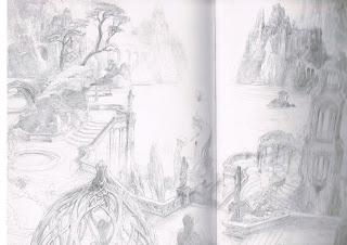
To take this idea further and experiment with it I decided to use many influences that I had recently seen. The sculptures of Paolozzi that I seen yesterday, a postcard of a Peter Howson painting that I bought, an image by Gustave Dore I found when studying tone in compositions and a sketch by Alan Lee that was a concept for Lord of the Rings. Each inspired one another so I have took each of these and compiled these into a single image.
Alan Lee sketch

Paolozzi sculpture

my model of seat of power/city

Peter Howson

Gustave Dore
These images where put together in a composition I felt could work. I then tried creating a tonal image to show light, mid tones and shadows. I had been reading up on this and many artist believe it works best to have all similar tone together in big shapes as this helps in creating form even if this is not exactly what something may look like in real life. This is this first time I have tried this type of exercise so I can only improve through time and practice. After this I then applied the rule of thirds and added in where the gutter of the book would also lie within the image. this helped me to adjust the image and determine where the omnipotent and main character should be placed. My next main consideration is whether to adjust where the light source is which will affect all tonal work or to work with my initial idea. This composition now feels as though it is worth developing further, each of the described steps is shown below.


Turner in January

After I had been to the picture hooks talk yesterday I went to see the Turner in January exhibition at the National Gallery. This choice was perhaps influenced by my meeting with Brian earlier in the week. When I had been showing the work I had been doing for this project Brian felt that the environments felt very important to the images. The characters story may be helped as much as by what is contained within the backgrounds than what is in the foreground. I explained that I liked the idea of each image being a story within itself, either prior, after or in contradiction to the text. Brian felt that these types of images may work better being kept rather loose without to much detail. The artist JWM Turner was proposed as someone who created landscapes in this fashion, often areas with little happening and others full of detail but always working together to make full compositions. This exhibition showed a great deal of this type of work, pieces that did not seem as finished as the works I had previously seen by Turner. Many of them used colour to hint at objects, details often left out for the imagination to fill in. For me to create such images will require experimentation with a variety of brushes and techniques to see what I can produce digitally. I now understand why Brian had advised me to look at such work as I think this could work for my project although the work will be determined by however I draw or paint digitally myself. Some of the painting that are on display in this exhibition are shown below.


Modern Art

Vulcan

Yesterday whilst I was down in Edinburgh I decided to go and visit the Modern Gallery. This was primarily to see a sculpture titled Vulcan created by Eduardo Paolozzi. The sculpture is two storeys high and my idea was to see what it looked like from the ground. This was to try and inform me of shapes and perspective for one of he images I plan to create for the book. An early scene with the text who belonged to a land of fragile freedoms. Within this image I imagine the main character about to embark on a battle with giants.This work is within the cafe area of Modern 2, I also went to look at other works by Dali and was very intrigued by the remake of Paolozzi's studio. This gave an insight into his life, mind and commitment to his art. Whilst there I also went to Modern 1 to see if any works were of interest to me, there I found another interesting sculpture of a man running. This might possibly feed into my work somehow, some photos of various works I seen are shown below.


Composition techniques and ideas

As I gain a better understanding of how the book may work with layouts and the images that could be used within each page I must consider composition. Each image will require thought on how the composition might work and allow for issues such as the gutter of the book.
I have been looking through a variety of books and magazines for ideas on composition. Many comment that the key elements of any successful image lie within strong composition, tonal work and lighting. Details and textures are no use without the three fundamental being correct. One book I read by Rob Alexander shows a variety of techniques for adding a sense of mood or emotion to a composition. I tried a few short experiments as described and found that these made sense. These types of techniques will need to be considered for each image. As the images develop I will write down what it is I am trying to say. Asking myself what is the story? how should the reader feel? what mood is set and how are the emotions conveyed? This book has short examples of techniques or ideas about all manner of subjects and may become a useful reference guide. The book cover and an example of the simple techniques are shown below.

I also found some useful articles in Imagine FX magazine. There were a few different articles written about composition covering things like rule of third, golden ratio and negative spaces. They also discuss many other aspects of composing an image. There are others books I have that also cover this and many other topics. My intentions are to initially create images in a manner that feels natural to me and then use some of these principles to enhance the image. This method of working should hopefully improve the images I create. I do not want to start with the rules first as these seem to tense me up, this is why I feel I should work more naturally in the first instance, then developed by ideas further using some of these rules or principles. Extracts from the magazine are shown below.


Book format and design

I have been playing around with both possible formats and designs or layouts for the picture book.
The first step involved going through the first dummy version of the book. What I was looking for were any double page spreads that didn't work. Either the story not being told fully enough through lack of text or not enough visuals to support the text. There were many areas that need consideration and adjustments, some of which were able to be solved by using the information found through my case studies. Some of the layouts used by Shaun Tan and Levi Pinfold were used to develop ideas for page layouts. This also altered the text greatly as many pages have much more text than in the first version. These changes will hopeful bring a change in the pace and flow of the story. Some spreads only contain a few words and a single image which I hope the reader will spend time trying to connect together. Others have more text and more small illustrations almost in symmetry, this again will change pace and offer the reader different situations which I hope will generate interest and explain the story better. Some of the methods involved in sketching out ideas are shown below.


The next stage involved designing layouts for each of the pages. My initial format was done using a 125mm page set up. This was due my intention of having a final book with pages 300x300mm. Whilst creating the designs for the pages I realised that I should also consider portrait. This is important as portrait picture books are actually slightly cheaper to produce than square books due to printing processes and widths of rolls required for each. The most likely size for me to use is 200mm wide x 250mm in height, this has lead to me creating two versions with each having some pages that differ slightly. The only thing remaining exactly the same is the text, although I have ran out of printer ink so I will need to fill in images once I can print out and see which format works best. Some examples of the page layouts are shown below.
pages 6 & 7 square layout
pages 6 & 7 portrait layout
pages 28 & 29 square layout
pages 28 & 29 portait layout


Picture Hooks: Talk 5

Yesterday I attended the last of the picture hooks talks with illustrator Debi Gilori who mentored Jonathan Bishop. Debi has been illustrating picture books for many years and works using traditional methods or materials. She showed some of her work which included images created using charcoal with secondary images in colour with pastels. These would be blended together by the designer who works for the publishers. Debi also discussed working with agents and publishers, the money side of things and confirmed as many others have that it is a job for enjoyment rather than riches and fame.
Running events in schools, libraries etc has become a major part of her work as this help to keep a steady income with around three days a week left for illustrating. These are the types of issues I must consider if I want to pursue such a career.
Johnathan was a student at Dundee University several years ago but had never found ways of entering the publishing world. This was in some ways due to lack of forcing himself to approach publishers. The picture hooks mentoring scheme has given him the confidence to now take such action. His initial sketchbook was full of characters but giving them backgrounds had always been something he has had issues with. Debi helped with this challenge and seen it a key element of picture books. The previous works that had backgrounds were pieced together and seemed a little incoherent but the images produced for display in the National Gallery have far more unity. Johnathan uses traditional materials but creates everything digitally, essentially scanning in all the work then removing edges,warping and playing with opacity etc. This gives his images a traditional feel as he does not add by digitally painting but rather removes leaving only the texture and colours created traditionally. This was interesting to discuss with him and could be something I try myself.

Monday, 18 January 2016

wc 18/01/16 progress, reflection and ideas

Progress

I have been unable to complete the second case study due to waiting on delivery of final book. This shall be completed upon arrival of the Greenling. This week has seen the beginning of experimental works such as composition and model making ideas. These types of works were supposed to be completed over two weeks ago along with the second dummy version and the third case study. This week on the programme shows the final case study to be carried out although this will not happen due to being behind the schedule. This week also shows that I will attend the final picture hooks talk on Saturday at the National Galleries.

Reflection

I am currently about two weeks behind schedule, this will likely increase as I plan to carry on with experimental works. Being behind schedule is not major concern right now as I do feel that I am just beginning to make progress in the right areas. Upon reading other dissertations I have realised that my first two case studies have perhaps involved more work than is actually required. However this depth of study was what I wanted to do to get a greater understanding of both artists and the methods or techniques used in their works. These have not only given me knowledge but should help me in solving many of the problems I will face with this project. Borrowing ideas, playing with them and adapting their methods to suit my own work may affect this project and my own future practices.

Ideas

I will continue with experimental works as these are fundamental to the success of the project. These works will hopefully lead to solutions for each of the images and spreads throughout the book. Carrying on with such works is vital as they lay the path for the more finished works. The next few weeks will be instrumental in dealing with issues of design, themes, what is shown and left out, how compositions are laid out. Getting these correct now will make the finishing process much easier so it is definitely worth while taking time with these experiments. This is probably due to me only considering taking two or three pages to the fully complete stages as the rest of the book shall remain in a slightly rougher form, so having the fundamentals correct is more important to the overall project. The third and fourth case studies will differ hugely from the first two and should take less time to complete and give me a better overall understanding of text, image, design and the publishing world in general.

Text-image models

During the group meeting held with Brian on Thursday I discussed how I had become interested in the space between the text and images in picture books. Brian advised me to look through a previous students dissertation to increase my awareness of terms. Today I have read the dissertation written by Liga Puida, the focus of the research was based around suitable text-image models.
The two types are interdependent and independent which both offer different methods for the reader to gain information. The interdependent images either compliment or enhance the text, where as independent can contradict, set moods or emotions and often leave gaps for the readers to fill in themselves. I have realised that all of these methods can be used within a single story, each may be suitable to certain scenes. This type of information is something touched upon in the analytical framework but not in a great a depth as this dissertation. Becoming aware of the terms used and how they work may come in useful when experimenting with what could be best to portrait each scene within the story. Considering how I want the reader to feel or what I want them to know might be guided with decisions on such facts, gaining this type of knowledge can only benefit my own work. The notes taken from this dissertation are shown below, they will most likely be used as and when required throughout the rest of this project.


Sunday, 17 January 2016

Fantasy into reality

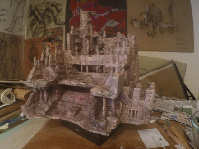
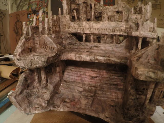
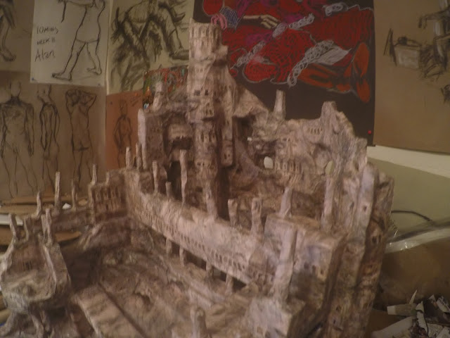
The bottom image on the sheet shown above was a sketch of an idea I had for a chair that was also a city in itself. The idea seemed rather random at the time, however I realised that this seat was almost like a seat of power. The city could be the centre of an empire with the seat made for a powerful leader. This in turn became part of an idea for one of the double page spreads as shown below.
The scene should depict when the main character has been captured and then sentenced to servitude or bondage by a great omnipotent. The idea was to use this chair to signify the strength of this character and to introduce the ships for the next scene.
This idea was difficult to sketch because it only exists in my mind, using similar methods of combining sketches photos etc is perhaps limited when try to create something like this chair. For these reasons I decide to build a physical version of it using polystyrene, cardboard and paper. This is something I could have perhaps made using Maya, however I wanted to make something in a more organic fashion forming shapes and blocks determined by what I have in my house. I also thought that it would be better drawing practice for me once complete. The rough shape or idea was formed in my head by my initial sketch but the actual shape and details occurred by themselves. The different stages of the process are shown below.
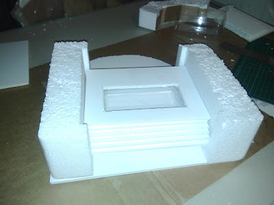
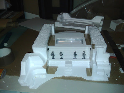
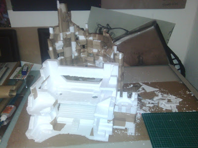
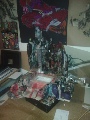
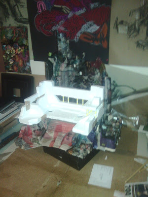
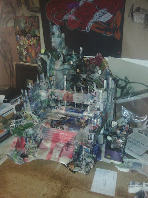
The idea in my mind was a sort of mixture between the colosseum in Rome and the city of Petra in Jordan with an element of the Roman Baths coming through. The finished work will both allow me to draw what is now in front of me and also add with my imagination or remove details that may not be required. This is only one small part of one composition, it has taken me the last three days to make. The time it may take to draw and then consider how the characters and composition may work as a whole will require many more sketches and experiments. This is proving to me that my choice to make only a dummy version is correct, trying to complete a fully finished picture book in the allocated time would not have allowed for such time spent on experimental pieces. Using such methods in future may become an essential part of my work flow so a great deal of time might be required to complete each picture book. Over the last few years I have managed to speak to many professional picture book illustrators. The fastest I have heard is six months from start to finish but generally most have said around ten months to a year as they are more than likely to have a few project on the go at once. I plan to carry out further experiments for different scenes within the story then carry out further case studies. I will draw this after the next case studies are complete and more time has elapsed for other ideas to develop with characters, composition and text, the finished chair is shown below.